Part I–Margaret – an art historical perspective
Like so many people across the world, we are in a holding pattern. Covid-19 cases are rising dramatically not only in the U S but across Europe, including Italy where we hope to go before many more months pass. Large Thanksgiving gatherings are discouraged, possibly Christmas as well with phone calls, texts, emails and Zoom meetings taking their place. It is a time to find a way to substitute or reorganize life to fit with our current condition. For Terry and me, that became delving into whatever creative impulses we have in order to give more direction to our daily lives. Although I have addressed this subject in a previous post, here I will expand on it to describe the processes and inspiration behind our works.
With Terry’s encouragement, my first project was a simple painting, veering to abstraction in contrast to past efforts. While it now hangs in the living room I regard it as simply an exercise, like an etude in the world of music and I haven’t been moved to try another. Rather, as I’ve mentioned in a previous post, I returned to a past interest in collage, abandoned when I wasn’t satisfied with my first results. Now, though, it seemed a good time to try again.
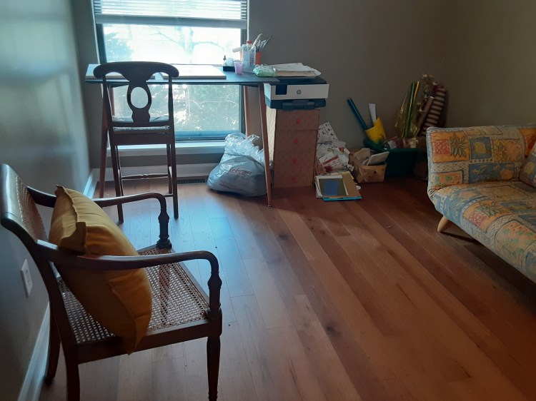
Fortunately, our third bedroom, originally cast as an office, gave me a workspace with good light in which to play with my newly rediscovered art form. Here, away from the main living spaces of our townhouse, I can store materials I want to have close at hand while I work. Although cluttered, the room is substantially less messy than when I am in the throes of creating a new piece when scraps litter the worktable, computer top and floor.
As I developed my first collage, I became aware that, for me, collage was “painting” with paper rather than combining collected objects to create an artwork. Many collage artists have done this skillfully and to good ends, but I never considered working that way.
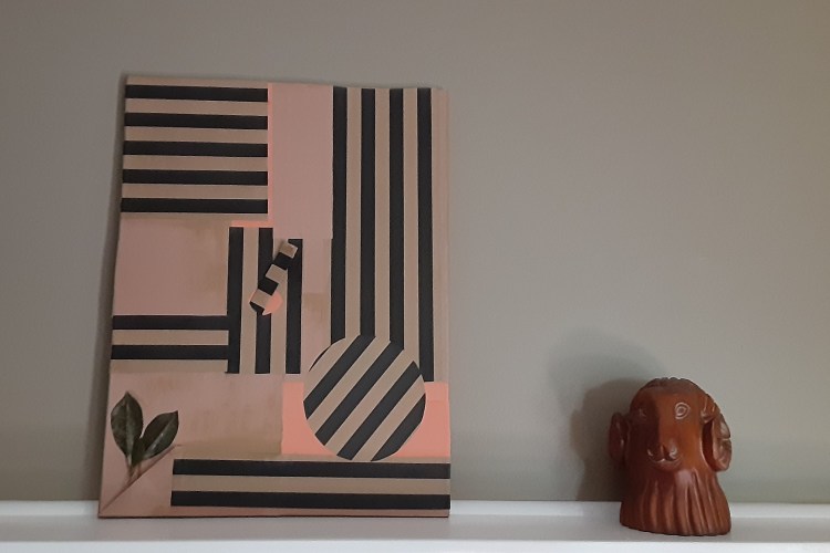
This first project was simple and quickly done. Construction paper and wrapping paper were the primary materials, with a couple of leaves added to bring interest to the lower corner. Even in this first project I was drawn to three dimensional components; while not very obvious in the photo, the narrow rectangular piece in the center projects out of the circular opening and is edged with a fringe. Below, a fold in the paper formed a pocket into which I tucked the leaves. As I was to do with subsequent collages, I first covered a pre-stretched canvas with sheets of colored paper before pasting the compositional features onto them. Glimpses of these background sheets add color to the black and tan striped wrapping paper. Although I was to give a title to subsequent collages, this one is only identified as “Opus I.”
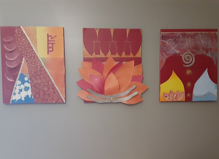
The Lakshmi triptych was my second project, inspired by the Indian bedcover in our bedroom. I learned of Lakshmi while traveling in India and decided to depict this Hindu “goddess of love” by referencing some of her many attributes in abstract form.
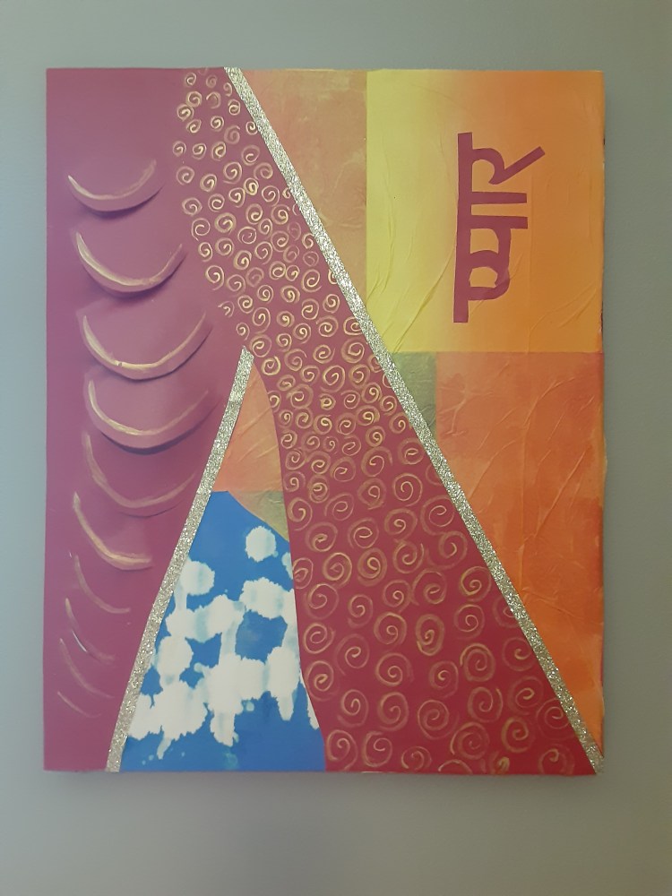
Now considering myself a little experienced, having finished one collage, I ventured further into three dimensionality.The draped material of Lakshmi’s sari was formed by cutting slits into the flat paper then lifting the cuts away from the glued edges. Gold spirals represent coins referring to Lakshmi’s association with financial wealth. The watery blue and white section I made by dripping bleach onto blue construction paper to represent the ocean from which Lakshmi was born.
The underlying colors are comprised of tissue paper, which, though I loved it for its colors, I quickly discovered was very tricky to work with. It tears easily as soon as the moist glue touches it so I learned to be very sparing with glue to prevent further problems. Still, too much pushing and stretching of even carefully glued tissue paper will lead to a bit of a disaster so I decided to like the little creases rather than try to remove them. For quite a while this piece lacked the Hindu word ‘love’ that is in the upper right hand corner, and the composition only felt complete when I eventually added this major component of Laksmi’s character.
The second in the Lakshmi triptych featured an elephant, one of Laksmi’s major attributes and the source of one of the variations in her name, Gaja-Laksmi. That association may be a reference to her immortal husband, Vishnu, the elephant god.
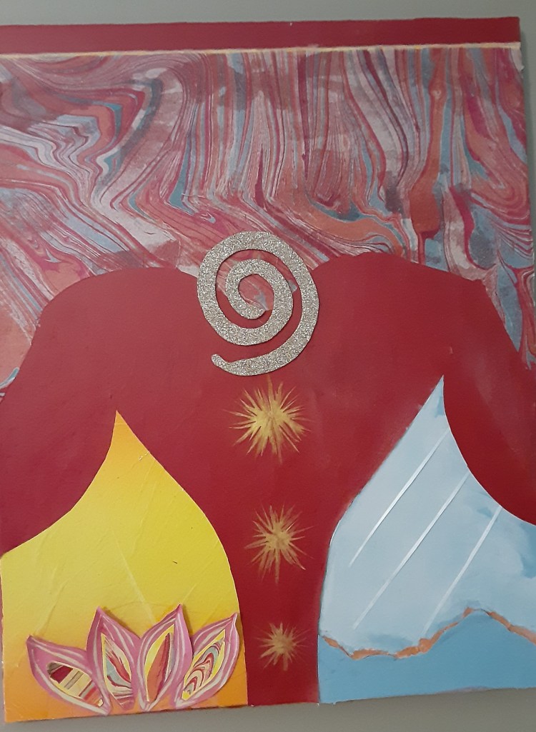
Lakshmi is virtually always shown with a lotus and is commonly referred to as “she of the lotus.” The lotus petals in the lower left corner have a small piece of tissue paper pasted in the center and the petals are folded into a point at the tip so that they project into three dimensional space against yellow tissue paper. On the right, rain formed from narrow strips of white ribbon falls onto mountains signifying the productivity of natural forces, a form of wealth. Orange tissue paper wedged into the mountain ridges highlights the nearer range while a suggestion of distant mountains looms beyond.
The final portion of the Lakshmi triptych forcused on the lotus.

Owls, representing wisdom, alternate with discreet lotus petals to form the upper register, leaving the main body for the depiction of a full lotus blossom. Petals extend beyond the edge of the underlying canvas and rise from the surface into three-dimensionality. To achieve that, I glued the foreground petals at their tip and base, pushing the body of the petal into a curve. Lakshmi has four arms, here forming the receptacle of the lotus, centered by a simple glob of dried gold paint, which I had retrieved from a scrap of wastepaper.
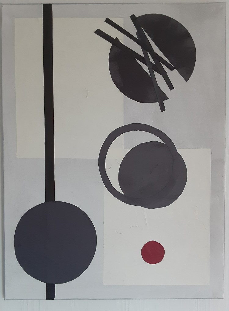
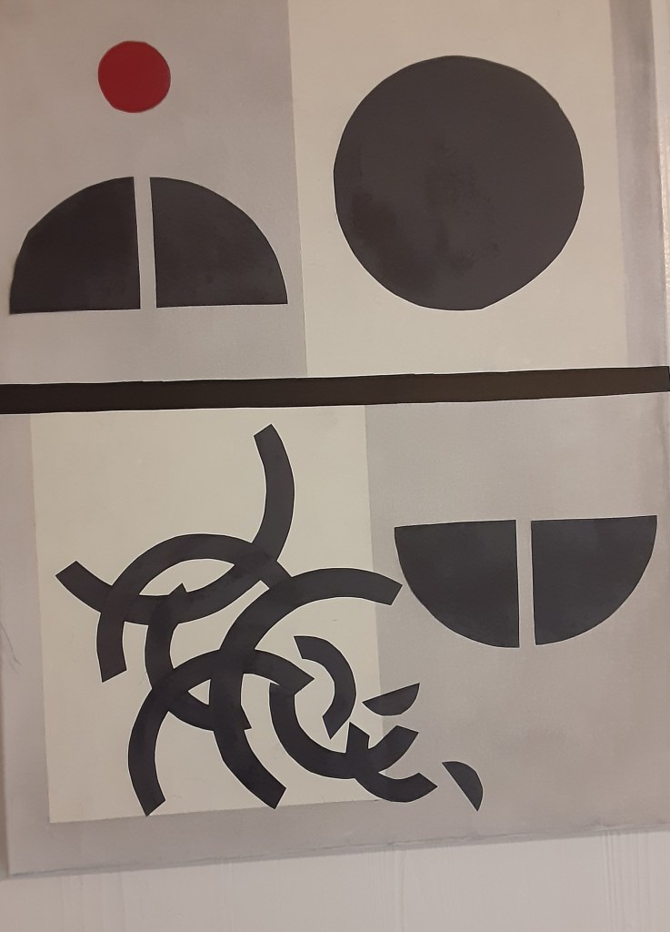
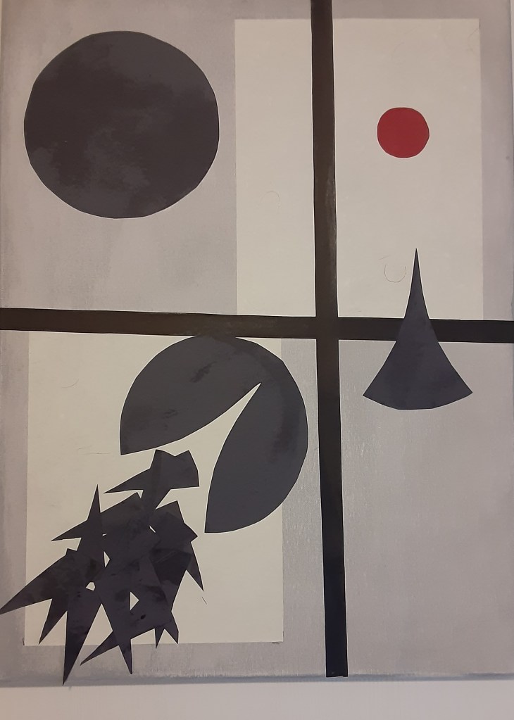
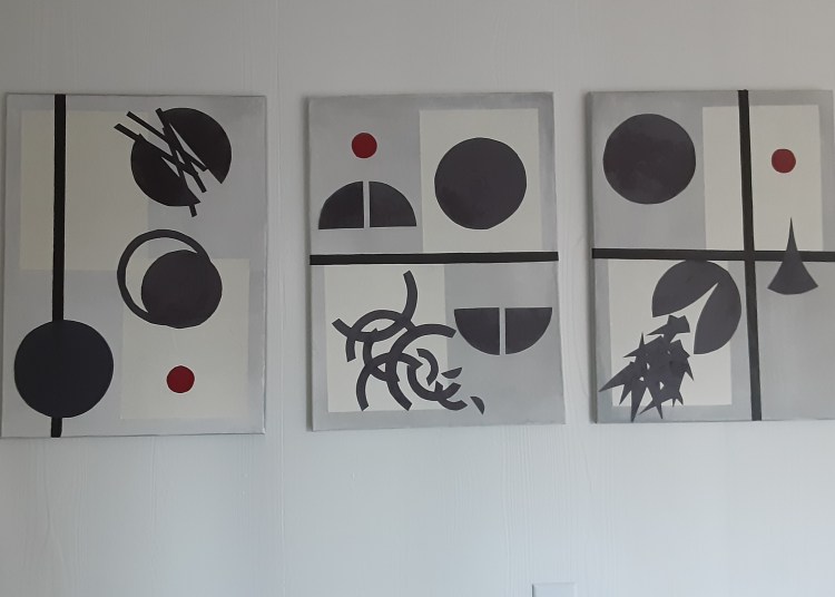
Following the completion of the Lakshmi triptych, I wanted to return to the notion that inspired my original attempt at collage–deconstruction of the circle. When I was a student, deconstruction, that is breakdown or alternate use of a known item, was a popular theoretical stance–popular with the public as well as seen in the re-creation of Pieter Mondrian’s paintings in clothing. It seems that these many years later I remained interested in its possibilities. This project would also be a triptych but now I wanted to turn away from vivid colors and work primarily in black, the absence of color, against a light gray background. Only an occasional red circle would be added as an accent. Below is the triptych, “Deconstruction of the circle.”
The circle is perhaps the most ancient of symbolic shapes, inspired by obvious natural objects like the moon and sun. The earliest houses were circular due to the ease of their building and the simple materials required and even today these qualities inspire some architects to return to this basic form. Given our human tendency to attribute meaning to the world around us, the circle also came to symbolize wholeness, completeness and spirituality–a shape without a beginning or end. These essential qualities, and many others, placed the circle foremost in my pursuit of creating collages based on geometric forms.
Not surprisingly, the square was the second most obvious shape to turn to as I delved into experimenting with geometric forms. Like the circle, the square has long been imbued with symbolic meaning. If the circle represents spirituality, the square with its four equal sides, represents physicality in its sense of solidity and strength. Again, human interpretation added elements from nature to underscore its integral nature–fire, earth, water and air as well as the four seasons. A building using the square as its basis incorporated all of these symbolic meanings as well as providing a solid structure meant to last for centuries.
In creating a collage built around the square, I returned to a more colorful, playful, representation. Since the square easily transforms into rectangles, triangles and cubes, all of these would play a role.
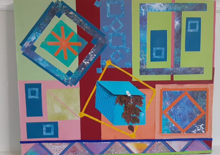
While this work stood in our basement waiting for paint to be applied around the edges, we experienced a pounding rain through the night, which left water across the floor, unfotunately damaging the piece along its lower edge. In art, though, correction is almost always possible, so I returned to my little art space to remove and replace the water-stained areas. Although I liked the first version better, I was able to more or less recreate the lower portion including a series of triangles along the bottom edge of the collage.
And, inevitably, I was bound to do a collage featuring the triangle. Like the circle and the square, the triangle with its three sides is imbued with significance. Three is the number representing spirituality–think of the triple nature of our Christian deity, for instance, but also representing human experience such as birth, life, death or past, present, future. And, of course representing good luck in the form of 777 as the winning number on slot machines. There are so many manifestations of the significance of the number three that a full discussion is a monograph in itself; I had challenge enough in working through the best means of representing the triangle in collage.
I had in mind a simple composition on a white background, an easy project I assumed. But the more I considered the triangle, the more I wanted to feature two difficult triangular designs–the Valknut, made up of interlocking triangles, and the Penrose triangle, often called the impossible triangle. Both of these are difficult to draw let alone create in pieces of paper to form a collage. I spent two days simply learning how to draw the Valknut.
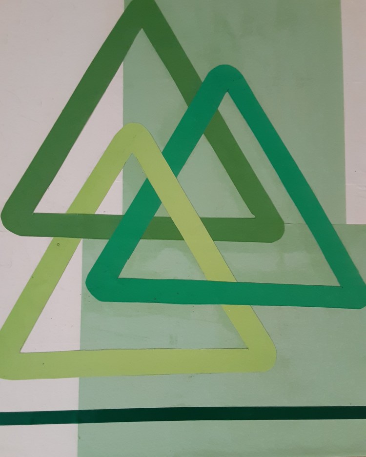
Sometimes called “Odin’s Triangle,” this image is thought to have originated in Norse mythology. Ancient runes show it in scenes depicting a slain warrior surrounded by his fellow soldiers, emphasizing the interdependance of men in battle. The interlocking triangles remain a powerful symbol of connection and apparently is a popular tattoo in the modern world where it’s expression of connectivity lends itself to a wide range personal interpretations . My own experience with it and therefore my own interpretation, is that something which appears simple may in fact be complex.
The Penrose Triangle was actually easier to draw, but a greater challenge in rendering it in paper.
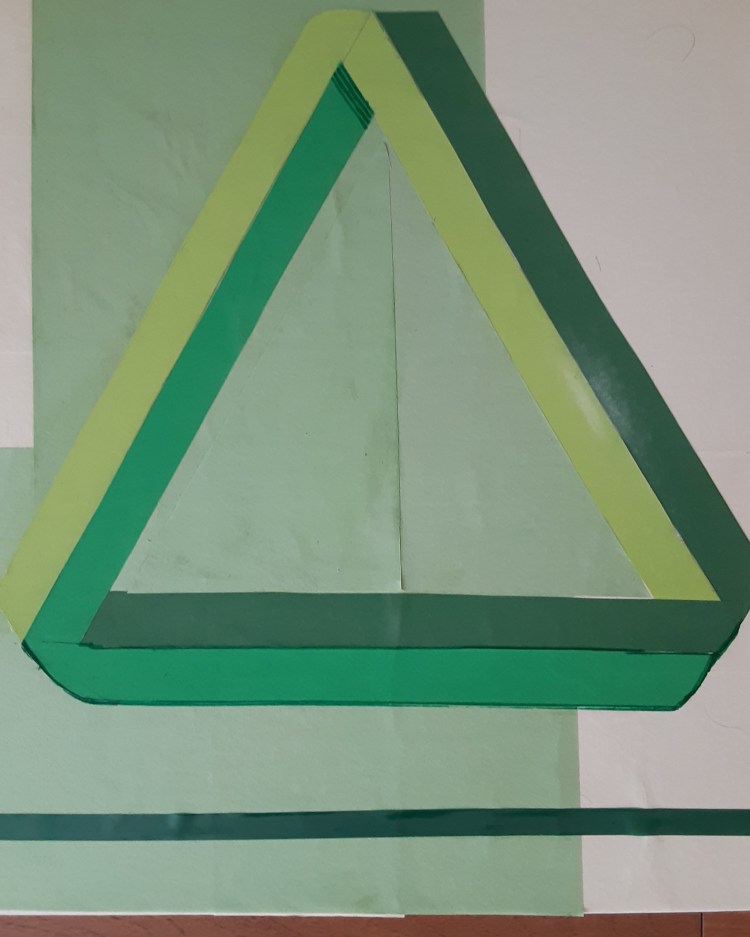
The Penrose Triangle is credited to Oscar Reutersburg, a Swedish artist who developed it in 1934 when he was only eighteen years old. It is a curiosity since, though it looks plausible, it cannot exist in reality given its different planes. Reutersbur went on to spend a lifetime drawing 3-D objects that were physically impossible, including the Penrose Triangle but equally well known for his “Impossible Stairs,” in which a series of steps would only lead one to remain on the same level. It is thought that Reutersburg may have been dyslexic, possibly contributing to his fascination with rendering the impossible.

Entering the world of triangles inspired me to explore them beyond the equilateral triangles that form the basis for these two collages. A conception has begun to form for the next work, already given a theme: The Triangle Struts its stuff.” I have yet to begin the project and am just beginning to think of ways to best play with the images. Moreover, it’s time to turn to “Part II,” Terry’s works, which have both inspired and encouraged me.
